1
2
3
4
5
6
7
8
9
10
11
12
13
14
15
16
17
18
19
20
21
22
23
24
25
26
27
28
29
30
31
32
33
34
35
36
37
38
39
40
41
42
43
44
45
46
47
48
49
50
51
52
53
54
55
56
57
58
59
60
61
62
63
64
65
66
67
68
69
70
71
72
73
74
75
76
77
78
79
80
81
82
83
84
85
86
87
88
89
90
91
92
93
94
95
96
97
98
99
100
101
102
103
104
105
106
107
108
109
110
111
112
113
114
115
116
117
118
119
120
121
122
123
124
125
126
127
128
129
130
131
132
133
134
135
136
137
138
139
140
141
142
143
144
145
146
147
148
149
150
151
152
153
154
155
156
157
158
159
160
161
162
163
164
165
166
167
168
169
170
171
172
173
174
175
176
177
178
179
180
181
182
183
184
| <template>
<view>
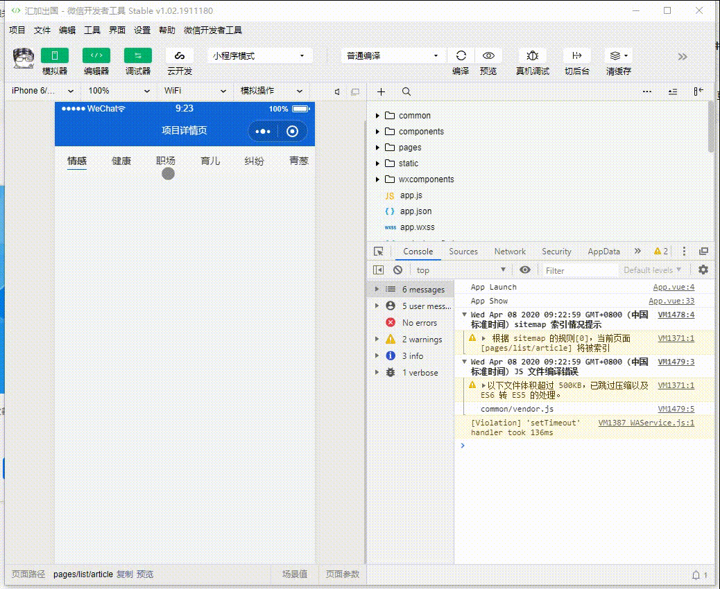
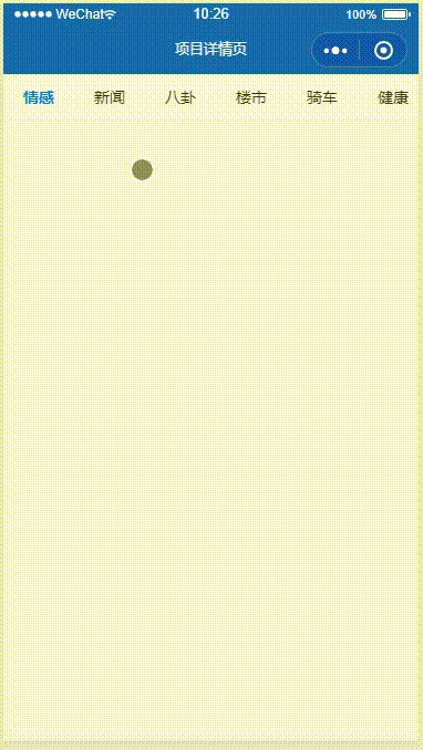
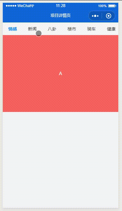
<scroll-view scroll-x="true" class="tab-h" v-bind:scroll-into-view="scroll_into" v-bind:scroll-with-animation="true">
<view v-for="(item, index) in tab_bar" class="tab-item" v-bind:class="current_tab==index ? 'tab-bar-active' : ''"
v-bind:key="index" v-bind:data-current="index" v-bind:id="item.id" v-on:click="change_tab">{{item.tit}}</view>
</scroll-view>
<view class="hr"></view>
<swiper class="swiper" v-bind:current="current_tab" duration="300" @change="change_swiper">
<swiper-item>
<view class="swiper-item uni-bg-red">A</view>
</swiper-item>
<swiper-item>
<view class="swiper-item uni-bg-green">B</view>
</swiper-item>
<swiper-item>
<view class="swiper-item uni-bg-blue">C</view>
</swiper-item>
<swiper-item>
<view class="swiper-item uni-bg-red">D</view>
</swiper-item>
<swiper-item>
<view class="swiper-item uni-bg-green">E</view>
</swiper-item>
<swiper-item>
<view class="swiper-item uni-bg-blue">F</view>
</swiper-item>
<swiper-item>
<view class="swiper-item uni-bg-red">G</view>
</swiper-item>
<swiper-item>
<view class="swiper-item uni-bg-green">H</view>
</swiper-item>
<swiper-item>
<view class="swiper-item uni-bg-blue">I</view>
</swiper-item>
<swiper-item>
<view class="swiper-item uni-bg-red">J</view>
</swiper-item>
<swiper-item>
<view class="swiper-item uni-bg-green">K</view>
</swiper-item>
<swiper-item>
<view class="swiper-item uni-bg-blue">L</view>
</swiper-item>
<swiper-item>
<view class="swiper-item uni-bg-red">M</view>
</swiper-item>
</swiper>
</view>
</template>
<script>
export default {
data() {
return {
// 当前选中tab索引
current_tab: 0,
// 当前滚动条距离左边的位置
scroll_left: 0,
// 当前滚动条滚动到id位置
scroll_into: '',
// 屏幕宽度
screen_width: 0,
tab_bar: [{
id: 'emotion',
tit: '情感'
},
{
id: 'news',
tit: '新闻'
},
{
id: 'diagrams',
tit: '八卦'
},
{
id: 'house',
tit: '楼市'
},
{
id: 'cars',
tit: '骑车'
},
{
id: 'healthy',
tit: '健康'
},
{
id: 'workplace',
tit: '职场'
},
{
id: 'all',
tit: '全部'
},
{
id: 'other',
tit: '其他'
},
{
id: 'music',
tit: '音乐'
},
{
id: 'movie',
tit: '影视'
},
{
id: 'sport',
tit: '运动'
},
{
id: 'country',
tit: '国家'
}
],
}
},
onLoad() {
// 首次获取屏幕宽度
uni.getSystemInfo({
success: (res) => {
this.screen_width = res.screenWidth
}
});
},
methods: {
// 点击tabbar事件
change_tab(e) {
let index = e.target.dataset.current || e.currentTarget.dataset.current;
this.run_tab(index)
},
// swiper滑动事件
change_swiper(e){
console.log('你啥时候执行啊', e)
let index = e.target.current || e.detail.current;
this.run_tab(index)
},
// 执行整个tab事件
run_tab(index){
// 记录当前滑动的位置
this.current_tab = index
// 如果点击了第4个以后的,滚动条向右移动屏幕的宽度
this.scroll_into = this.tab_bar[index].id
}
}
}
</script>
<style>
.tab-h {
height: 80rpx;
width: 100%;
line-height: 80rpx;
background: #f7f7f7;
font-size: 16px;
white-space: nowrap;
}
.tab-item {
padding: 0 36rpx;
display: inline-block;
}
.tab-bar-active {
font-weight: bold;
color: #007AFF;
}
.hr {
height: 1rpx;
background-color: #eeeeee;
}
.swiper{
height: 500rpx;
text-align: center;
}
.swiper-item{
height: 500rpx;
line-height: 500rpx;
}
</style>
|